Page properties
Define the general setup of the page.
| Property | Description |
| Name | A unique name for the page – not used in user interface . |
| Index | The order in which this page should appear in the tab menu. |
| Title | The label that will be shown for the page’s menu tab. |
| Header | The main header on the page. |
| Description | A description of the page just under the main header. |
| generatedPasswordRuleName | The chosen Password Configuration setup as specified in the Password Configuration section. |
| textOnAutogeneratedPassword | The text that will appear on the ”generate password button” in case the chosen Password Configuration is set to autoGenerate=”True”. |
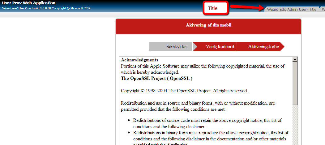
Below is shown where the properties Title is used on an Wizard page.
Required attributes
Define the rules for when a user will shown this page. If no required attributes are added, then anyone who is already registered as a user in Identify, will have access.
| Property | Description |
| Name | The incoming claim type, whose value is used to check whether a user should see the page. References the claim types specified by name in the Attributes section. |
| Value | The expression that the value should fulfill in order for the page to be shown to the user. Below are a few examples of the expressions that can be used:<Attribute name=”role” value=”Superuser”/><Attribute name=” ” value=” “/><Attribute name=” ” value=” “/>Please notice that values are case-sensitive. |
Insert attributes
Firstly, we need to specify the general wizard node
| Property | Description |
| title | The label that will be shown for the wizard |
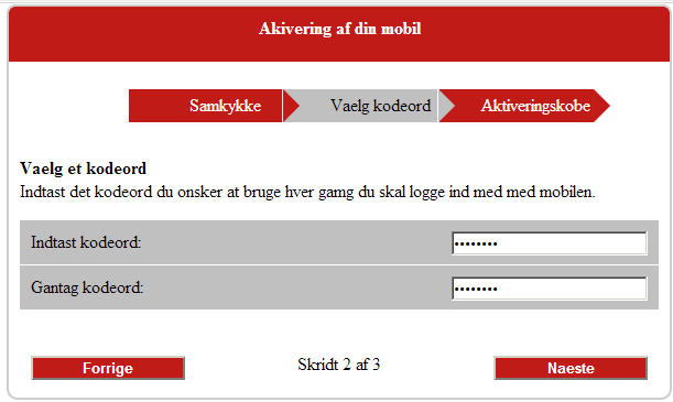
| stepIndexFormat | Its default value : ”Skridt {0} af {1}” where {0} is the current step and {1} the total of the steps on the wizard |
| nextButtonText | Specify the text for the button for moving to the next step |
| backButtonText | Specify the text for the button for moving to the previous step |
| saveButtonText | Specify the text for the button at final step for saving the info on wizard |
| cssClass | we use “pdknc_wizard” css for the wizard and it’s specify at the Css stylesheet section |
| titleCssClass | we use “pdknc_wizardTitle” css for the wizard ’s title and it’s specify at the Css stylesheet section |
| nextButtonCssClass | we use “pdknc_wizardNextButton” css for the wizard ’s next button and it’s specify at the Css stylesheet section |
| backButtonCssClass | we use “pdknc_wizardBackButton” css for the wizard ’s back button and it’s specify at the Css stylesheet section |
| stepIndexCssClass | we use “pdknc_wizardStepIndex” css for the wizard ’s index step and it’s specify at the Css stylesheet section |
| headerNavigationBarCssClass | we use “pdknc_wizardCrumbMenu” css for the wizard ’s header and it’s specify at the Css stylesheet section |
| footerNavigationBarCssClass | we use “pdknc_wizardFooterNavigationBar” css for the wizard ’s footer and it’s specify at the Css stylesheet section |
Under wizard node, we can specify the generator type : wizard step or simple editor.
|
1 2 3 4 5 6 7 8 9 10 11 12 |
<Section Name="Info 1"> <Attribute name="name"></Attribute> <Attribute name="email"></Attribute> <Attribute name="role"></Attribute> </Section> <Section Name=Info 2"> <Attribute name="smsphone"></Attribute> <Attribute name="text"></Attribute> <Attribute name="number"></Attribute> <Attribute name="multi"></Attribute> <Attribute name="single"></Attribute> </Section> |
Wizzard step
| Property | Description |
| Name | A unique name for the page – not used in user interface . |
| Index | The order in which this page should appear in the tab menu |
| Title | The label that will be shown for the wizard ste |
| Description | A description of the wizard step – not used in user interface |
| cssClass | we use css for the wizard step ’s css. Currently we have 3 existed css stylesheets :+ “pdknc_readmeStep”+ “pdknc_password”+ “pdknc_accessCodeStep” (its setting is same with “pdknc_password”)and it’s specify at the Css stylesheet |
| titleCssClass | we use css for the wizard step ’s title. Currently we have 3 existed css stylesheets :+ ” pdknc_readmeStepTitle”+ ” pdknc_passwordStepTitle”+ ” pdknc_accessCodeStepTitle” (its setting is same with “pdknc_ passwordStepTitle “)and it’s specify at the Css stylesheet section |
| descriptionCssClass | we use css class for the wizard step ’s description. Currently we have 3 existed css stylesheets :+ ” pdknc_readmeStepDescription”+ ” pdknc_passwordStepDescription”+ ” pdknc_accessCodeStepDescription” (its setting is same with “pdknc_passwordStepDescription “)and it’s specify at the Css stylesheet section |
| summaryValidationCssClass | we use css class for the wizard step ’s validation text. Currently we have 3 existed css stylesheets :+ ” pdpdknc_readMeEditorControl”+ ” pdknc_passwordStepSummaryValidation”+ ” pdknc_accessCodeStepSummaryValidation” (its setting is same with “pdknc_passwordStepSummaryValidation”)and it’s specify at the Css stylesheet section |
Here is the setup sample for wizard step :
|
1 2 3 4 5 6 7 |
<Step stepIndex ="1" name ="readme" title ="Samkykke" description ="" cssClass="pdknc_readmeStep" titleCssClass ="pdknc_readmeStepTitle" descriptionCssClass="pdknc_readmeStepDescription" summaryValidationCssClass ="pdknc_readmeStepSummaryValidation"> <!—input the attribute here --> </step> |
Simple editor
| Property | Description |
| Index | The order in which this page should appear in the tab menu. |
| Name | A unique name for the page – not used in user interface . |
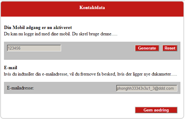
| Title | The label that will be shown for the simple editor step |
| Description | A description of the simple editor – not used in user interface |
| saveButtonText | Specify the text for the save button on simple editor |
| cssClass | we use css for the simple editor ’s css. Currently we have 2 existed css stylesheets :+ “pdknc_mobilAdgangSimpleEditor”+ “pdknc_kontaktdataSimpleEditor”They are same 90% and can be specified at the Css stylesheet section |
| titleCssClass | we use css for the simple editor ’s title. Currently we have 2 existed css stylesheets :+ “pdknc_mobilAdgangSimpleEditorTitle”+ “pdknc_kontaktdataSimpleEditorTitle”They are same and can be specified at the Css stylesheet section |
| descriptionCssClass | we use css for the simple editor’s description. Currently we have 2 existed css stylesheets :+ “pdknc_mobilAdgangSimpleEditorDescription “+ “pdknc_kontaktdataSimpleEditorDescription “They are same and can be specified at the Css stylesheet section |
| saveButtonCssClass | we use css class for the simple editor’s save button. Currently we have 2 existed css stylesheets :+ “pdknc_mobilAdgangSimpleEditorSaveButton”+ “pdknc_kontaktdataSimpleEditorSaveButton”They are same and can be specified at the Css stylesheet section |
| summaryValidationCssClass | we use css class for the simple editor’s’s validation text. Currently we have 2 existed css stylesheets :+ “pdknc_kontaktdataSimpleEditorSummaryValidation “They are same 90% and can be specified at the Css stylesheet section |
Here is the setup sample for simple editor :
|
1 2 3 4 5 6 7 8 9 10 11 12 13 14 |
<SimpleEditor index ="1" name="mobilAdgangGroup" title ="Mobil adgang" description ="For at se Din Pension....... " saveButtonText ="Slet denne mobil adgang" cssClass ="pdknc_mobilAdgangSimpleEditor" titleCssClass ="pdknc_mobilAdgangSimpleEditorTitle" descriptionCssClass ="pdknc_mobilAdgangSimpleEditorDescription" saveButtonCssClass ="pdknc_mobilAdgangSimpleEditorSaveButton" summaryValidationCssClass ="pdknc_mobilAdgangSimpleEditorSummaryValidation" > <!—input the attribute here --> </ SimpleEditor> |
On each simple editor and wizard step, specifies the claim types that we want to save values for.
| Property | Description |
| Name | References the claim types specified by name in the Attributes section. Settings for how the claim type fields will appear, validations, etc. are set in that section as well. |
| canUserChooseCorrectValue | Given that the system in incoming token receives a claim value for an existing user, which is different than what is already registered in the database, then this boolean setting defines, whether the user will be allowed to choose which one is the correct one. |
| valueResolveBy | If the property canUserChooseCorrectValue is set to false, then given that the situation occurs, where the incoming value of a claim type is different from the one in Identify, this property defines which one will be inserted as default value in the page. Possible options are ”Token”, meaning that the value of the incoming token will be used, or ”Identify”, meaning that the existing value in Identify will be used. |
| cssClass | we use css for the attribute ’s css. The specification and demo are specified at the Css stylesheet section |
| titleCssClass | we use css for the attribute ’s title. The specification and demo are specified at the Css stylesheet section |
| descriptionCssClass | we use css for the attribute ’s description. The specification and demo are specified at the Css stylesheet section |
| editorCssClass | we use css for the attribute ’s editor. The specification and demo are specified at the Css stylesheet section |
| editorTitleCssClass | we use css for the attribute ’s editor title. The specification and demo are specified at the Css stylesheet section |
| editorControlCssClass | we use css for the attribute ’s editor control. The specification and demo are specified at the Css stylesheet section |
| generateValueExpression | Specific the autogenreate rule for the value when the generateResetButton is enable. Its default value : ” # # # # # # # # #”The demo is specified at the Css stylesheet section |
| generateResetButton | Specify to show/not show the Generate and Reset button. Its default value is False |
| generateButtonText | Specify the text for the generate button for the attribute. Its default text is ”Generate” |
| generateButtonCssClass | we use css for the attribute ’s generate button. The specification and demo are specified at the Css stylesheet section |
| resetButtonText | Specify the text for the reset button for the attribute. Its default text is ”Reset” |
| resetButtonCssClass | we use css for the attribute ’s reset button. The specification and demo are specified at the Css stylesheet section |
| enableEditButton | Specify to show/not show the Edit button. Its default value is False |
| editButtonText | Specify the text for the edit button for the attribute. Its default text is ”Edit” |
| editButtonCssClass | we use css for the attribute ’s edit button. The specification and demo are specified at the Css stylesheet section |
| editorControlEditCssClass | we use css for the attribute ’s edior after clicking on the Edit button. The specification and demo are specified at the Css stylesheet section |
Notice that the rule for Avoid elevation aka Avoid upsize (please refer to the Safewhere*Identify guidelines to learn more) is actually in effect on Self Management pages. When activated, any incoming claim type that includes a value, which the user does not have the right to in Identify will be ignored. Options that the user does not already have, will also be hidden as options when Claim Type is shown on the page.
Another rule that is on the other hand not enforced, which may exist when using the Safewhere*Identify interface for the specific claim, is the Restrict view and editing of sub-organizations. Should you wish to enforce this rule in UserProv, you will have to configure individual pages for each organization accordingly.
Default or Auto generate values attributes
Specifies both default values as well as options for auto generating values. The latter is typically used for username type fields, where the claim type is set to hidden with an autogenerate option, so that user would automatically be given a username, but not told about it.
An example of this section is:
|
1 2 3 4 |
<Attribute name="role" valueExpresion="%%%%@role"> <DefaultValue>ClaimTransformationAdmin</DefaultValue> <DefaultValue>SystemSetupAdmin</DefaultValue> </Attribute> |
It is actually possible to have both default values and auto-generate values, since they are triggered at different times. Default values are inserted into the page in case it is empty on opening the page (which it would be if there were no values for the claim in the token or in identify), whereas autogenerated values are first applied at the point of time where the page is saved to Identify and it is found to be empty.
| Property | Description |
| Name | References the claim types specified by name in the Attributes section. |
| valueExpression | Specifies the value that will be autogenerated for the field. Notice that the symbol ’#’ will be automatically replaced by a number and the symbol ’%’ will automatically be replaced by a character.An example of a valueExpression could be ”CopenhagenOfficeUser####%%%”. |
| DefaultValue | The default value to be given to the claim type if empty. |